

Spartan Pass: Elevating Your Spartan Game Day Experience
MI 420 Interactive Prototyping A ssignment
In the iterative design process for the Spartan Game Day app, I began by conducting a competitive analysis to understand industry standards and identify areas for improvement. From there, I sketched initial design concepts, which I translated into paper prototypes for early-stage testing. Based on user feedback, I refined the designs, creating high-fidelity mockups and then developing an interactive prototype. Throughout each stage, I continuously implemented feedback, refining the user experience to ensure the final design was intuitive, engaging, and aligned with user needs.
.png)
Background
For Spartan fans attending game day at the stadium, managing tickets, finding information, and navigating the venue can be overwhelming and time-consuming. Fans often struggle to keep track of essential updates, locate their seats, and find concessions or accessible amenities in a busy and crowded environment. Current game-day apps provide some features but lack a cohesive, user-friendly experience tailored to the unique needs of Spartan fans, which impacts engagement and the overall enjoyment of the game-day experience.
Goals
Enhance
Game-Day Convenience: Simplify ticket management, navigation, and access to game information to reduce stress and improve the overall experience for fans.
Boost Fan Engagement: Offer personalized features, exclusive content, and interactive elements like live score displays and team stats to deepen fan connection and excitement for the game.
Clarify
Streamline Navigation: Design an intuitive UI with clear, consistent navigation and organized information to enable users to easily access key features without getting overwhelmed.
Improve Accessibility and Support: Incorporate a virtual chatbot and easy-to-find information on amenities like concessions and accessible seating to ensure all fans can enjoy the event comfortably.
Tools
-
Figma
-
Paper Pencil
-
Capcut
Methods
-
Competitor analysis
-
Sketching
-
Paper Prototyping
-
Storyboarding
-
Interactive Prototyping
Deliverables
-
High-fidelity interactive prototype
The Process
Competitive Analysis
To develop Spartan Pass, a streamlined app for the football game-day experience, I conducted a competitive analysis by evaluating three major sports apps: the Lions App, the NFL App, and the New York Rangers App. Each offered valuable insights into effective features and potential pitfalls for enhancing user experience.

Lions App
The Lions App delivers a highly engaging experience packed with content, providing users with a team page that showcases player stats and highlights. However, the heavy information density made it somewhat overwhelming to navigate, with design inconsistencies and cluttered menus detracting from usability.
-
Strengths: Rich features, informative homepage, smooth page transitions.
-
Weaknesses: Cluttered menu, inconsistent UI and icons, difficult-to-read fonts, and some information is buried in subpages.

NFL App
The NFL App stood out with its clean, easy-to-navigate UI that avoids overcrowding. The minimalist menu page provides quick access to relevant information, and the app offers engaging homepage replays and a virtual chatbot for assistance. This streamlined design inspired the simplicity and clarity I aimed for in Spartan Pass.
-
Strengths: Clear navigation, engaging homepage replays, and virtual chatbot for user support.
-
Weaknesses: Some text sizes were excessively large, subpages hinder back-and-forth navigation, and page layouts have dense information sections.

New York Rangers App
New York Rangers App:
The Rangers App excels in user engagement, with a dynamic opening animation and an organized schedule page. The clear organization of game times by month and the intuitive bottom navigation made it easy to find key information. However, the app’s menu only opens halfway and feels cramped, with essential features somewhat hidden within it.
-
Strengths: Intuitive navigation, organized schedule, engaging visuals.
-
Weaknesses: Cramped menu display, hidden features, and small text on certain pages.
Paper Prototype

The design process began with paper sketching to quickly brainstorm ideas and visualize the core structure of the Spartan Pass app. Sketching allowed for rapid iteration and flexibility, as I explored various layouts, feature placements, and navigation options. This stage was instrumental in shaping the overall user flow, where I could test multiple approaches for the main menu, homepage, and chat feature without committing to a digital format. These initial sketches established a foundation for the app’s core structure, helping me identify the essential features and user pathways that would drive the game-day experience.
Storyboard
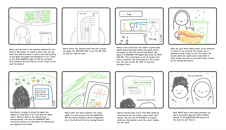
The next stage involved storyboarding, where I mapped out the user journey in detail. The storyboard captured key moments in the user’s interaction with the app, focusing on game-day scenarios like ticket scanning, finding seat locations, and accessing real-time updates. Storyboarding helped in understanding the user’s needs at each stage of the game-day experience and emphasized the app’s role in enhancing convenience and engagement. It also highlighted potential pain points or decision-making moments, guiding the refinement of app features to meet user expectations seamlessly.
High-Fidelity Interactive Prototype
Summary
The Spartan Pass app project was created to elevate the football game-day experience for Spartan fans by developing a streamlined, engaging digital tool that makes attending games simpler and more enjoyable. Inspired by a competitive analysis of sports apps like the Lions App, NFL App, and New York Rangers App, the Spartan Pass app offers essential features such as ticket management, real-time game updates, interactive seating maps, team stats, and a virtual support chatbot. The design process moved through multiple stages—starting with paper sketches and interactive prototypes, advancing to storyboarding and video prototyping, and concluding with a high-fidelity digital prototype.
Throughout this process, I gained valuable insights into user-centered design, including how to balance the density of information with simplicity and how to prioritize features based on user needs. Each stage of prototyping provided an opportunity to gather feedback and identify areas for improvement, such as making navigation more intuitive, minimizing information overload, and ensuring UI consistency. By iterating and testing each version, I refined the app’s design to create a cohesive, intuitive experience tailored to Spartan fans.
Key Areas
01 User-Centered Problem Solving
Through user testing and feedback, I learned the importance of viewing the design from the user’s perspective to ensure an app that’s easy and enjoyable to navigate
02 Iterative Improvement
Each stage of prototyping—from sketches to interactive digital versions—offered a chance to identify and address issues. This iterative approach taught me how even small design adjustments could significantly enhance usability and overall user satisfaction.
03 Balancing Engagement and Clarity
Analyzing popular sports apps showed me how critical it is to keep the interface clean and navigation straightforward, even when incorporating engaging elements like animations, interactive maps, and live stats.
04 Design Consistency
Ensuring a cohesive visual and interaction style across all pages improved usability and created a smoother experience for users, a key lesson learned from examining the pitfalls of competitor apps.